Harmonizing Linens with Seasonal Greenery and Décor
TL;DR: This blog shows how event planners can achieve true visual harmony by pairing seasonal table linens with greenery through principles of color theory, floristry, and design. Each season offers distinct palettes and techniques that balance linens with natural foliage for elegant, cohesive tablescapes.
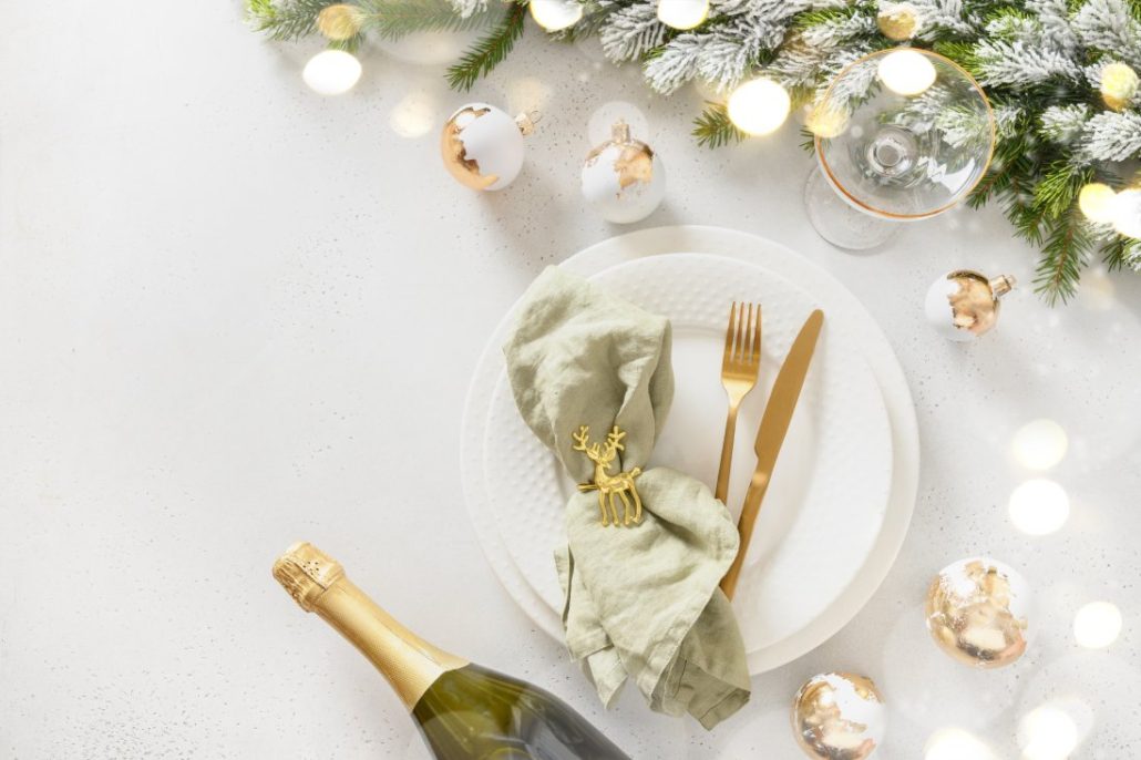
- Winter: Complementary red-and-green, neutral whites, or bold high-contrast black with greenery create festive elegance.
- Spring: Pastels, analogous palettes, and combinations like sage with coral/peach evoke freshness and balance.
- Summer: Bold brights such as cobalt, coral, and yellow gain grounding and cohesion through lush tropical greenery.
- Autumn: Earth tones, sage or olive, and neutrals with bold accents highlight fall foliage and harvest textures.
Visual harmony is a sense of balance and coherence achieved by thoughtfully and deliberately pairing décor elements. For event planners, achieving visual harmony requires the careful selection of seasonal table linens and greenery.
For truly inspired seasonal decorating, you need to go beyond the basics.
To achieve contemporary style, top event designers often use principles of color theory to build seasonally resonant palettes. By drawing inspiration from floristry and nature, designers craft rich, elegant tablescapes that draw on the senses.
In this guide, we’ll go season by season, sharing ways that professional designers harmonize their greenery and event decor. Continue reading to discover our favorite contemporary seasonal decor ideas grounded in design theory.
Winter: Evergreen Elegance and Cool Contrasts
At winter events, it’s common to decorate with evergreen foliage. To harmonize linens with this season’s decorations, consider the powerful contrast and balance of color.
Classic Red and Green
One classic approach to winter design is using complementary colors. For example, rich red table accents against green evergreens. Red and green sit opposite each other on the color wheel, so this pairing creates a high-contrast scheme that truly pops.
Consider: Forest-green linen with red napkins and holly or poinsettia centerpieces.
Winter Whites
A crisp white or ivory tablecloth offers an elegant neutral canvas. White table linens allow those seasonal greens to stand out in stark contrast. Consider incorporating contemporary seasonal decor ideas like metallic accents, too.
Consider: White or ivory tablecloth with a runner of evergreen garland, plus silver candle holders and frosted pinecones. Add crystal or gold accents for a trendy seasonal decor idea that feels dramatic.
Cool Colors or High Contrast
Likewise, cool hues (like silver, icy blue, or frosty white) all complement greenery by enhancing the wintry atmosphere. These analogous cool tones (neighbors on the color wheel) create a serene harmony.
In contrast, however, cutting-edge seasonal decor trends also include monochromatic or high-contrast palettes for winter. Some event designers are using all-black or charcoal table linens with greenery and white blooms for a modern, striking twist.
Consider: Black or charcoal tablecloth, white floral and greenery centerpiece, and black candles.
Spring: Fresh Pastels and Blooming Accents
Event linens for spring should mirror the freshness and vibrancy of new growth.
Pastel Palettes
In springtime, pastel hues are a natural choice. Lighter fabrics like chiffon or airy cotton blends work well, too. Lighter hues and materials easily echo the breezy, delicate feel of springtime. Lighter colors have less saturation, so they complement the subtle beauty of springtime greens and florals.
Consider: Blush pink linens with sage green eucalyptus runners and gold cutlery.
Garden-Inspired Colors
Analogous color schemes are hues adjacent on the color wheel. They often feel right in spring’s gentle landscape. For example, yellow, green, and blue are neighbors on the color wheel. You can choose shades like butter yellow, soft green, and pale turquoise to evoke a garden in bloom with natural visual harmony.
Consider: Mint-green tablecloth, white lace or eyelet runner, and centerpieces of yellow daffodils and baby’s breath.
Nature-Inspired
Not everyone wants to achieve an “easter egg” look in springtime. Instead, incorporate natural textures and deeper accent colors, like sage green with peach or coral accents. The peach adds a gentle pop of warmth against the green, creating balance.
Consider: A soft sage green tablecloth or runner with coral or peach napkins and small peach-toned charger plates or glassware.
Summer: Vibrant Hues and Lush Foliage
Summer is when nature’s greenery is at its fullest. Likewise, summer decor often calls for more energy and boldness. Your choice of seasonal table linens can reflect that liveliness.
Vibrant Colors
In bright summer sunlight, vibrant colors come alive! This year, bold hues like red, chartreuse, and cobalt blue are taking center stage in event design. The easiest way to infuse brights into your design is through your table linens, especially vibrant cloth napkins.
Consider: A punchy Marseille Bleu tablecloth with coral and citrus yellow cloth napkins.
Island-Inspired
Let your greenery serve as the grounding element in your vibrant design. Tropical greenery, such as monstera leaves, can evoke a cool island feel. Brightly colored flowers will pop against that backdrop. Decorate with hibiscus flowers or lilies for instant energy.
Consider: A vibrant coral or hot pink table runner over a white tablecloth. Add centerpieces of ferns or monstera leaves.
Sunshine Hues
According to color theory, warm hues like yellow and orange exude energy and excitement. Make sure to balance them with some cooler or neutral touches to keep the tablescape from becoming overwhelming. We love an easy, breezy white tablecloth in summer. Likewise, yellow sits near green on the spectrum, so lush greenery will keep things feeling energetic.
Consider: Lemon-yellow linens paired with arrangements of glossy green lemon leaves, white blooms, and actual citrus fruits.
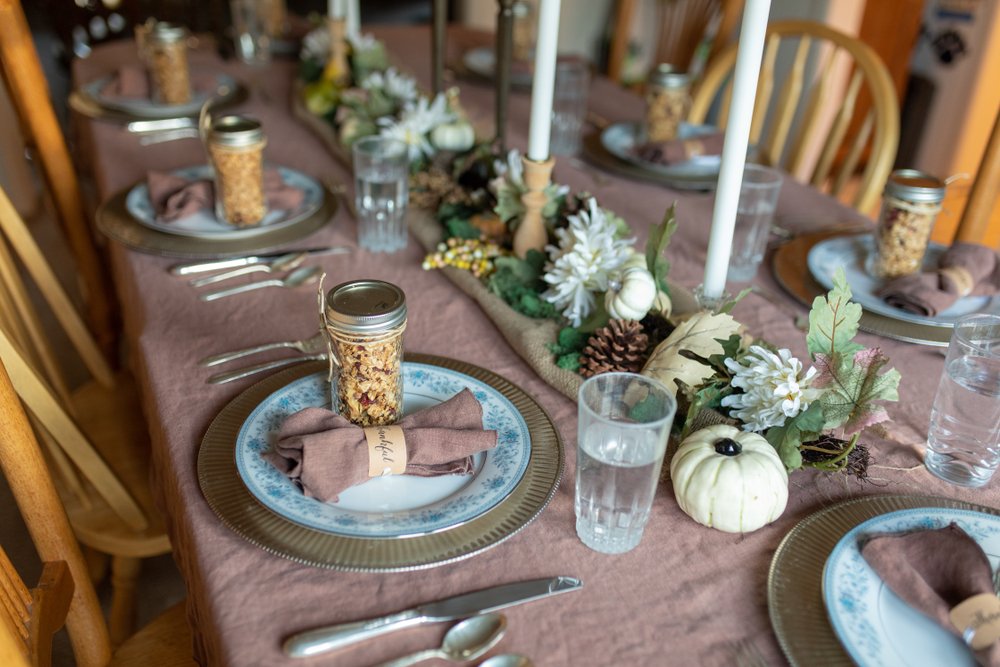
Autumn: Warm Earth Tones and Bold Highlights
Autumn decor often draws on the richness of the harvest and the changing foliage. However, it’s possible to achieve an autumnal style without leaning into seasonal cliches.
Warm Earth Tones
Lean into warm earth tones for the base and then accent with pops of seasonal color, inspired by classic fall foliage. Burgundy reds, burnt oranges, golden yellows, rustic browns, and mossy greens set a luxurious and warm tone.
Consider: Burnt orange tablecloth with sage green napkins, accented by centerpiece greenery.
Softer Greenery
In the fall, we recommend beginning to move away from the vibrant greenery of spring and summer. Using sage green or olive linens can highlight the subtler autumnal greens and browns in dried florals. Aim for a harmonious, earthy palette.
Consider: Sage tablecloths with ivory and pumpkin-orange centerpieces, paired with dried florals.
Neutrals with Bolds
A neutral linen is a calming canvas for more vibrant, jewel-toned autumn décor. Pumpkins and leaves will pop off a cream or taupe tablecloth without adding visual clutter. Neutrals never go out of style and allow those seasonal oranges, reds, and dark greens to shine.
Consider: A burlap or rough linen runner on a wooden table, combined with greenery and pops of orange.
Bring it All Together with Seasonal Table Linens
No matter the season, the key to harmonizing linens with greenery and decor is to let nature be your guide.
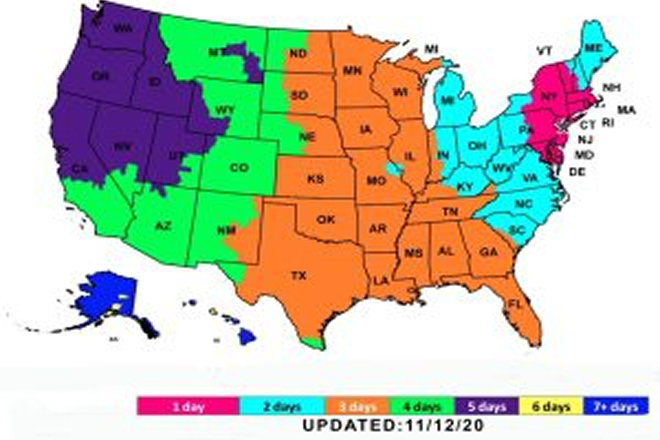
You can find seasonal table linens in every shade and hue at ASAP Linen. Add your linens to your cart and they’ll arrive two or three days before your event. Create a stunning seasonal tablescape, then send them back as-is. We’ll handle the rest.
Ready to start planning for next season’s soiree? Check out our selection of tablecloth rentals for your next event!