Mixing and Matching Linens for Stunning Event Décor
TL;DR: This blog explains how to use table linen color combinations to elevate any event. Readers learn why linens matter, how color theory and psychology guide choices, and which palettes work best for weddings and parties.
- Linens set the tone, highlight themes, and enhance décor and photography.
- Color theory offers structure: complementary, analogous, monochromatic, and accent pops.
- Color psychology shows how hues like blue, green, or gold affect guest mood.
- Example wedding table linen colors include ivory with gold and burgundy, blush with champagne, and navy with silver.
- Practical tips cover balancing neutrals with bolds, layering textures, and factoring in lighting.
By applying these ideas, event planners can confidently create stunning linen color combinations for any celebration.
Table linen color combinations play a significant role in creating an unforgettable event atmosphere. Not only can they tie a theme together, but they have the power to evoke your desired tone. From the moment guests arrive, they’ll be in the correct mindset for whatever type of celebration is to come.
Clearly, experimenting with linen color combinations can help you transform an empty venue into a stunning celebration space. However, there are some principles of design and color theory that can help ensure you get it right.
In this guide, we’ll explore how to mix and match table linen colors with confidence. Plus, we’ll share inspiring wedding table linen colors that you can recreate using ASAP Linen’s collection.
Continue reading to choose the right linen colors for your next wedding, gala, party, or event!
Why Linen Colors Matter
Your event linens are essentially the backdrop for your event. They instantly and wordlessly reinforce the mood and theme of your event. However, they also play a major role in creating aesthetic harmony in a venue or event space. Everything from your flowers to your tableware pop when paired with coordinating table linens that bring out their nuances.
Choosing the right table linen colors can:
- Set the mood (romantic, vibrant, sophisticated, playful).
- Highlight brand or wedding palette themes.
- Create visual contrast that makes décor pop.
- Ensure photos of the event are cohesive and striking.
In essence, choosing the right table linen color combinations can do a lot of the work for you. That’s why it’s so important to carefully consider the combinations you choose. Applying principles of color theory and color psychology can help.
The Basics of Color Theory for Event Linens
Understanding a few simple principles of color theory makes it easier to create memorable linen color combinations.
In essence, color theory is the science of how colors interact with one another. It helps you thoughtfully design shades and hues to achieve specific feelings in a viewer. We recommend consulting a color wheel when experimenting with table linen colors.
Here are some color theory basics to help you get started:
- Complementary Colors: Colors opposite each other on the color wheel (like navy and gold, or burgundy and sage). These create dramatic, high-contrast looks perfect for formal events.
- Analogous Colors: Colors next to each other on the wheel (like blush, peach, and coral). These offer a harmonious, soft aesthetic, often ideal for weddings.
- Monochromatic Colors: Different shades of the same color (like light blue, medium blue, and navy). These bring depth and sophistication without overwhelming an event space.
- Accent Pop: Using one bold hue (such as emerald green) against neutral linens like ivory or charcoal. This creates maximum visual impact.
Ultimately, color theory is the science behind why certain combinations work or don’t work. However, it can also be wise to appeal to emotions and associations to achieve a desired effect.

Using Color Psychology to Guide Your Linen Choices
Colors have the power to instantly influence the way your guests feel upon entering a space. Color psychology is the study of how colors and color combinations impact human behavior.
Essentially, linens can subliminally send messages about the energy level and behavior expected at a given event. After all, you wouldn’t choose the same linen combinations at a dance party as you would at a corporate gathering.
Color psychology is driven by a combination of expectations and passive associations. It’s why color is used in marketing to send messages. Likewise, color psychology is used in spas and medical offices to inspire calm and serenity.
Here are a few common associations you can keep in mind when choosing table linen colors:
- Blue: Calming, trustworthy, perfect for corporate events or seaside weddings.
- Green: Natural, refreshing, ideal for outdoor gatherings or eco-inspired themes.
- Red/Burgundy: Passionate, luxurious, fitting for romantic dinners and elegant galas.
- Gold/Yellow: Warmth, cheer, and celebration. Perfect for summer events or milestone parties.
- White/Ivory: Purity, elegance, timeless choice for weddings.
Both color theory and color psychology can be used in tandem to guide your linen choices.
Inspiring Linen Color Combinations
Now, let’s put what we understand about color theory and psychology to work. We’ve created a few tried-and-true pairings based on these principles. You can recreate any of these combinations at your events. Feel free to adjust them to better suit your theme or expectations.
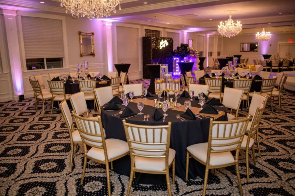
Classic Elegance
- Ivory Tablecloth
- Gold Overlay
- Burgundy Napkins
Perfect for weddings and formal banquets, this combination feels regal and romantic.
Modern Contrast
- Charcoal Tablecloth
- White Napkins
- Emerald Green Runners
A sleek pairing that works beautifully for contemporary receptions and chic corporate events.
Romantic Softness
- Blush Tablecloth
- Dusty Rose Napkins
- Champagne Runner
A dreamy choice for bridal showers and garden weddings.
Nature-Inspired Freshness
- Sage Green Tablecloth
- Ivory Napkins
- Wooden Charger Accents
This earthy palette creates a relaxed, organic vibe for rustic or outdoor events.
Ocean-Inspired Serenity
- Navy Tablecloth
- Light Blue Napkins
- Silver Chargers
Great for coastal weddings or nautical themes, this palette is both calming and polished.
Tips for Mixing and Matching Table Linen Colors
Are you ready to create some table linen color combinations of your own? The principles above are a great place to begin, but here are some tips that might help:
- Aim to balance neutrals with bolds. Too many strong hues can feel overwhelming. Let one color shine while others support it.
- Incorporate textures in addition to colors to add visual interest. Mixing matte, satin, or sequined fabrics can add visual depth.
- Remember that lighting also impacts mood, and can change the way your color choices appear. Candlelight makes warm tones glow, while cool lighting enhances blues and silvers.
- Don’t forget the bigger picture. Your linen color combinations should reflect your event theme. Keep things like the season or your branding palette in mind when curating an event color scheme.
With these tips in mind, you can craft unforgettable spaces that wow your guests from the moment they walk in.
Create Your Next Table Linen Color Combination
ASAP Linen offers convenient, affordable linen rentals in nearly any trending color you can imagine. Just add your tablecloths, napkins, and tableskirts to your cart. We’ll ship them to you just a few days before your event.
There’s no need to store them long-term. Just decorate, and send them back as-is when the event is over. We’ll handle the rest.
Are you ready to create your next table linen color combination? Check out our selection of tablecloth rentals for your next event!